
#20: Los Angeles Dodgers
 | Although I like that the Dodgers recognize California’s large LatinX population, there is no different colors on the Jersey from regular ones, and it really only looks like a Spring Training uniform. |
#19 Baltimore Orioles
 | If the multi colored arm sleeves were all around the jersey, than this City Connect would be in the top 5, but it is only on 1/24 of the uniform, and the rest is black and white, and that is why it is so low on the list. Another reason is because has so much potential to be great, but it isn’t, and that is very disappointing. |
#18 Atlanta Braves
 | This jersey shows a lot when it comes to Braves history, symbolizing Hank Aaron and his quest for 715 homers, and unlike the Dodgers, it introduces an abnormal color to the original home uniform. Some cons to the City Connect is that it is almost the exact same as their Alternate. I think that they should also incorporate the tomahawk into it. |
#17 Pittsburgh Pirates
 | At least the Pirates actually made there jersey look real. The Pirates could have done a lot more for the jersey to go up and beyond. Pinstripes would have been nice. One great thing about the Pirates city connect is the big bold font with Pittsburgh’s acronyms (PGH) across the front. |
#16 Los Angeles Angels
| The Angels used there geography to have surfing as there theme, with “Angels” being wavy and like surfing on the ocean, but other than that, the jersey is really plain, because the only color besides red is creme, and that doesn’t stand out compared to other jerseys higher on this list. |
#15 San Fransisco Giants
 | The Bay Area is always very misty, and the Giants show that on the sides of there uniform with the Golden Gate Bridge being engulfed in it, but the monstrous G on the front hogs up a lot of useful space. |
#14 Chicago Cubs
 | Due to Chicago’s extreme fan base, designers wanted to honor them, and in doing that, they put “Wrigley Ville” across the front of the jersey. In my opinion, I like this jersey, but as we get closer to the top of the list, you will see extreme designing that overpower this one. |
#13 Kansas City Royals
 | Just like the Cubs uniform it is very detailful, with the double font across the front with multiple crowns. The theme sybolizes Kansas City’s “fountains and art deco architecture.” with Barbecues and Jazz. |
#12 Cincinnati Reds
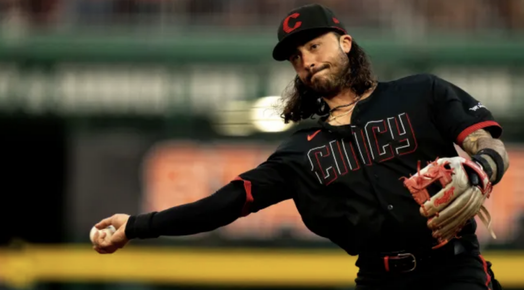 | The Reds City Connect Uniform is one of the newer and electric ones, which makes it ever so likable. Changing the classic “C” on the hat makes it look much more modern, and the designers did a great job making the Red jump out against Black. |
#11 Milwaukee Brewers
 | Milwaukee’s City Connect is a bright, cool and soothing shade of blue, and I recommend you to buy it, as it is one of the rarer uniforms. One the negative side, “Brew Crew” was a little basic. |
#10 Boston Red Sox
| The unique yellow and blue with “617” represents Boston history, A.K.A the bombing of the Marathon in 2013. The Red Sox love this uniform because since it came out, they are 22-4. |
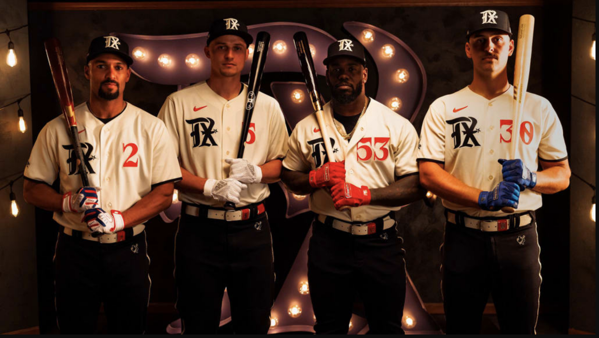
#9 Texas Rangers
| Debuting on April 17, 2023 the Rangers city connect instantly became a want to get. In the home games of the 2023 World Series, their were hundreds of fans wearing this. |
#8 Arizona Diamondbacks
 | The Diamondbacks use their name and being next to Mexico to create a new name: Serpentes, meaning serpents in Spanish. Unlike many other teams, I think the uniforms would have looked better if the D-Backs had the dark red as the main colors, and the rest be creme. |
#7 Colorado Rockies
| The Rockies uniform describes their location: The Mountains. I like how the colors are unique, and the font fits the jersey perfectly, but there needs to be a bit more to make it higher on this list. |
#6 Seattle Mariners
 | I love that the Mariners city connect has a trident, as it refers to the sea, and Mariners are sailors. This jersey in fact should not have different colors. Their is really nothing negative about this jersey, but other ones just are better. |
#5 Washington Nationals
 | In my opinion, the Nationals uniform would have been No.1 if they had made it more capital of the USA vibe, but of course, there is the alternate hat. The Nationals did really well in making the jersey electric, by making the Pink stand out against the grey, which is relatively hard to do. The Cherry Blossoms, known in D.C are the biggest highlight of the jersey. |
#4 Chicago White Sox
 | Like the Mariners, the White Sox should not have changed their colors. The font and pinstripes makes the jersey stand out, while the new hats put a W on the uniform. “Southside” is the name on the jersey, which is good, but I think “Black Sox” would have been better. |
#3 Miami Marlins
 | The Marlins completely changed their uniform, from very dark colors, to very light and bright colors. The jerseys pay tribute to the Sugar Kings, a Triple-A affiliate of the Cincinnati Reds that played in Cuba from 1946 through 1960. Both the uniform patch and the logo on the hat call back to the original Sugar Kings logo. |
#2 Houston Astros
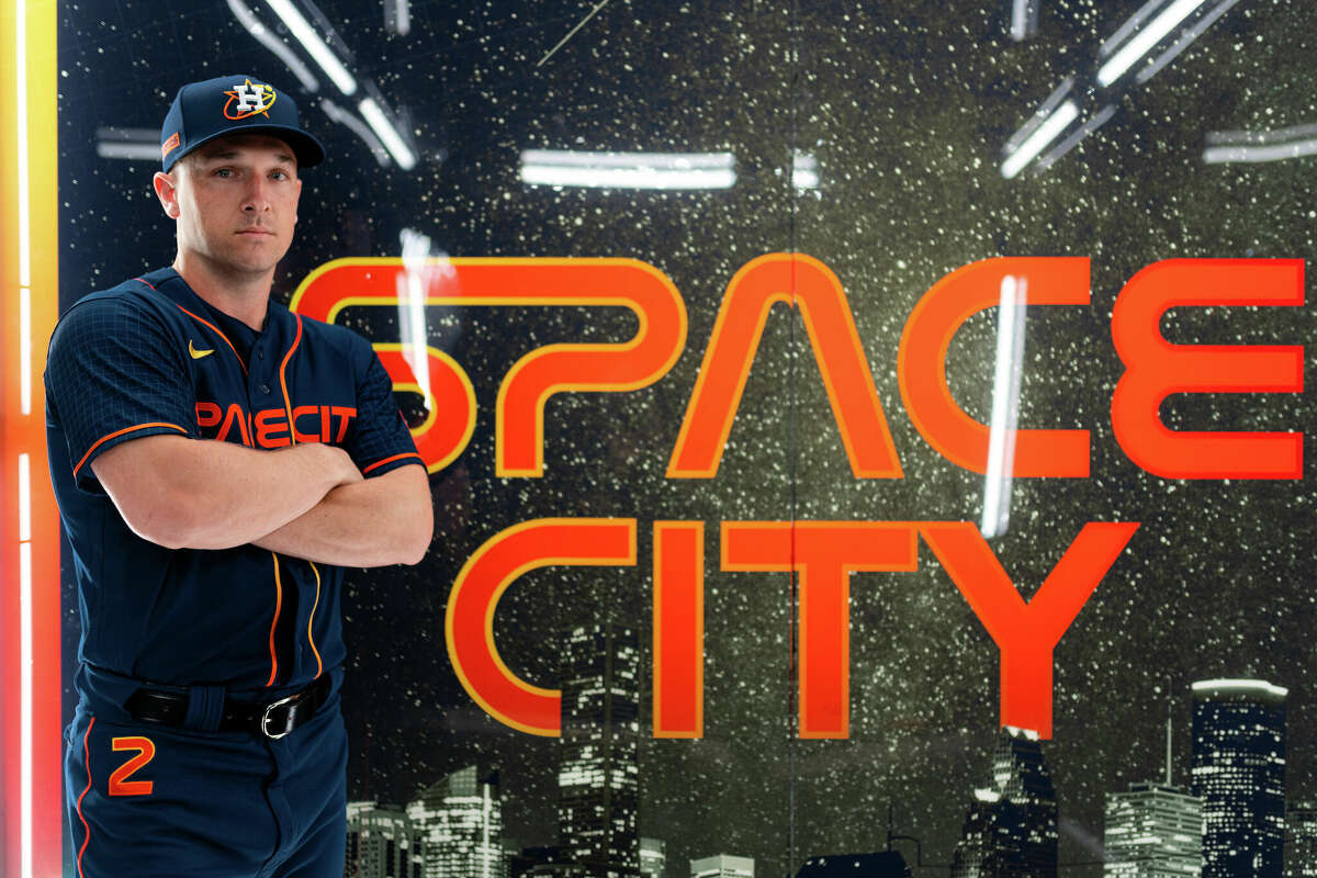 | The Astros jersey represents The jerseys take inspiration from the iconic tequila sunrise Astros uniforms from the 1970s while paying tribute to the city’s intertwined history with space travel. The uniform font resembles the iconic typography of NASA, while the sleeves feature a grid pattern inspired by star charts. Talk about the hats! Electric. |
#1 San Diego Padres
 | Finally, Number 1, the San Diego Padres. Personally, I love very colorful and vibrant uniforms, and the Padres check off both squares. When the jersey came out, there was a lot of critizisim, but as this uniform says so much about the diverse population in San Diego, it is hard to resist, and that is why it is at the top of my list. |
This is a great list! Fully agree on the top three. Personally, I would have put the Angels a bit higher on the list. You make a fair point about the jerseys being plain, but I kind of like that about these jerseys. The Seattle jerseys are like a throwback to the 1980s with a bit of pizazz added on top!
All in all, great job on this blog post! I love the list and the thoughtful descriptions of each uniform!